
A good Valentine's Day greeting card often combines elements of romance, affection, and personal touch. Here are some key graphical elements that can make a Valentine's card visually appealing: 1. **Color Scheme**: Predominantly red and pink, symbolizing love and affection. Soft pastel colors can also be used for a subtler, more elegant look. 2. **Imagery**: Heart shapes are classic, along with roses, cupids, and doves. For a more personalized touch, illustrations that resonate with the recipient's interests can be included. 3. **Typography**: Elegant, flowing fonts for the main message, possibly with some words emphasized with a bolder or more ornate script. The message should be easy to read yet aesthetically pleasing. 4. **Layout**: A balanced layout that harmonizes text and imagery. Space is often left for a personal handwritten message. 5. **Textures and Materials**: For physical cards, the use of high-quality paper or unique textures can add a tactile dimension to the card. 6. **Additional Elements**: Depending on the recipient, adding playful elements like glitter, ribbons, or even interactive parts like pop-ups can enhance the card's appeal. 7. **Personal Touch**: A space for a personal message or the inclusion of shared memories or inside jokes can make the card more intimate and special. 8. **Envelope Design**: Often overlooked, but a matching or complementary envelope design adds to the overall experience. Remember, the best Valentine's card resonates with the feelings and personality of both the sender and the recipient.

See More

Fight

Male character from death note
😡🤬🌧️🐝

Kawaii

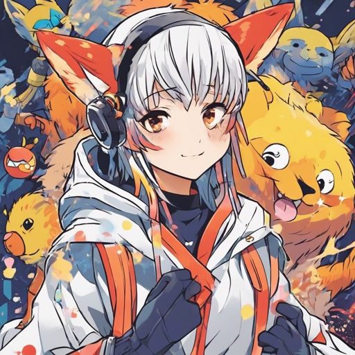
Fox furry wearing a coat in the rain

Fox therian in the rain

Emo outfits

Emo outfits

The character of a girl around 20-21 years old. He lives in the cyberpunk Montevideo of 2089. She is a neo-goth, she dre...

Dragons king

Thick snake lady

Cat lady

Zombie Anime, 2 boys working together

Satoru gojo holding a cat

Satoru gojo holding a cat

Satoru gojo holding a cat

Vegeta and venom fusion

Anime

Cute High School Girl Makes Handsome Boy Happy

Popular guy falls in love with shy nerdy girl who has glasses

A man and a woman sitting in hospital beds holding hands

A sad romance between a man and a woman who both have cancer and fall in love with each other

Hentai small

Rugged, tough, athletic, short black hair, blue eyes, army man, in army clothes, smoking a cigarette, handsome, perfect ...

Rugged, tough, athletic, short black hair, blue eyes, army man, in army clothes, smoking a cigarette, handsome, perfect ...

The grim reaper separating the poor from the rich

The grim reaper separating the poor from the rich
The grim effect

The grim effect

The grim effect

The grim effect
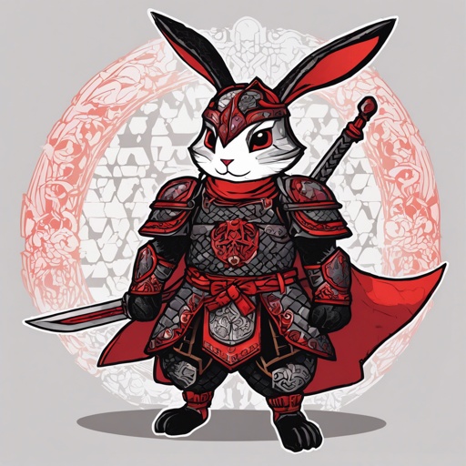
Dnd rogue rabbit folk hummanoid. Black and ran fur patterned and leather armor.
Rabbit folk black tan rogue

Snow Leopard furry

Cute short and chunky girl with short blonde hair

Cute short and chunky girl with short blonde hair

Cute short and chunky girl with short blonde hair
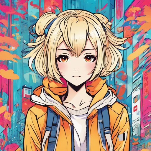
Cute short and chunky girl with short blonde hair
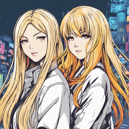
Shorty and curvy girl with long blonde hair
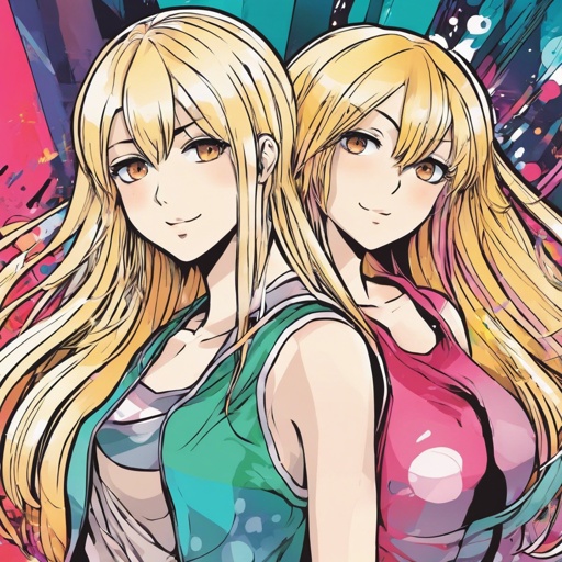
Shorty and curvy girl with long blonde hair
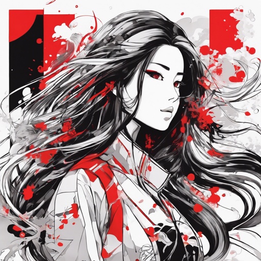
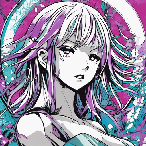
woman, beautiful, sweet, long hair, black and white, splashes of red, tall

Resident evil 8 villages